Tips for Maximizing Your YouTube Page
With over a billion users and millions of channels it can be hard to stand out on YouTube. So, besides making great videos and promoting them what are some tips that can be used to help your page standout.
1. Add links in the Bio Page
The bio page allows for a description of the channel as well as the option to provide links. The links will be visible to anyone coming to your channel in the header to the right. This can include a link to a website and social channels such as twitter and facebook. Also, links back to pages give those a bit of help in SEO. 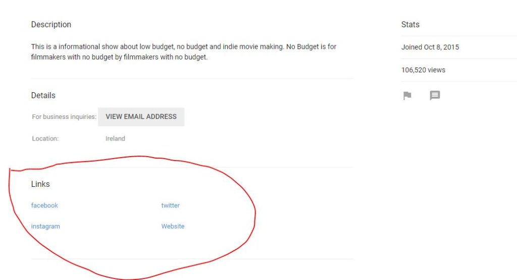
2. Customize the Header
Speaking of the header take some time to customize the image at the top. The header is a great opportunity to show the brand associated with your channel. Some YouTubers provide information about how often they post to the channel. For the No Budget page we she a bit of what our brand is about, so people will have an idea of the type of videos they will find.
3. Logo
Have a logo at the top. It is a good idea if your header compliments the logo. This can be through a color scheme or fonts used in the text.
4. Title, Description, Tags/Keywords
Use a proper title for your video, description and keywords in your videos. Be sure that they align to what the video is but also that they align to what the channel does. Would someone want to go to a channel that promotes itself as a movie review channel but then has video of cats playing with string? Maybe, but maybe not. Do the cats in a separate branded channel for cats. Make sure that you aren’t throwing out keywords that you think will get search results but are not related to the video. The description so be a longer version of the title for the video and is a good place for links to related content.
5. Custom Thumbnail
As with having matching titles and descriptions make sure the thumbnail matches. This isn’t just making sure the image is relevant but that the thumbnail also represents your brand. Look at the Happy Pear guys and how well the thumbnails are consistent with the brand and appeal to the audience. Or the thumbnails we use at No Budget. they reflect what is in the video as well as a consistent look across the channel that aligns with the brand.
Tags In
Related Posts
Leave a Reply Cancel reply
This site uses Akismet to reduce spam. Learn how your comment data is processed.
